Wireframes- Sketches and Ideas.
Tools Used
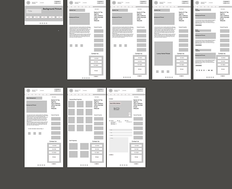
Website Sketch
A clear overview of the website I designed; the page structure, user flow, layout, information architecture, intended behaviors, functionality. Basically sketched an entire user experience and interface.
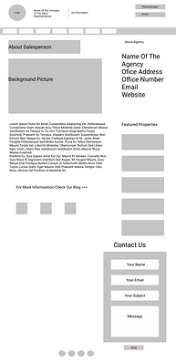
The purpose of this low fidelity design, was to guide me in designing a "USER FOCUSED" concept website, clarify and define website features (such as navigation bars, buttons, CTAs, descriptions, images etc. ) and quick and easy to create a blueprint of what the final design would be structured.
While designing this low fidelity framework, my main focus was to keep it simple, maintain clarity and keep it user focused. Before creating the design I had to do some research to understand the users I will be designing for, this led me to creating user personas, defining use cases, and researching other industry competitors.
The home page was my jumpstart and it gave me an idea of how many screens I wanted to design for. My user flow was clear afterwards. My goal was to ensure that the architecture information on the website was clear enough for users to navigate through different pages thereby reducing the pressure on customer service, lower levels of user frustrations and ultimately gaining user satisfaction and trust.
See More Pictures Below


____________________________________________________________________________________________________________
Responsive Wireframes (Designs)
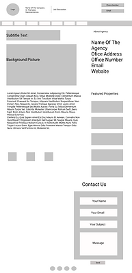
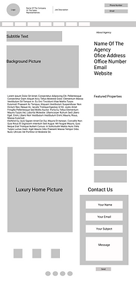
I designed this responsive wireframe for users to access on any device. the goal of was to design webpages that detect the users screen size and orientation, and change the layout accordingly. With the use of grids I was able to design appropriately for screens with similar width such as mobile, tablets and desktops respectively.
Typography, and layouts of images, buttons were designed to be responsive accordingly to the device screen the webpage is viewed in.
I used the interaction design foundation's practice and consideration while designing this responsive webpage which were;
Mobile first approach; I scaled up mobile screens to suit large screens which simply means I first designed as a mobile screen and then scaled up my website features designs to fit desktop screens. Simply because most users have smartphones which gives the possibility of checking websites on their mobiles first.
Create fluid grids and images, used scalable vector graphics that are interactive and flexible, design for 3 or more devices (In this case I designed for desktop, tablet and mobile screens)
Aimed for minimalism and simplicity of course not deviating from the goals of the website and effect on users. Prioritizing and hide contents based on their relevance.
Tools Used
See Pictures Below

Desktop Screen

Tablet Screen

Mobile Screen
